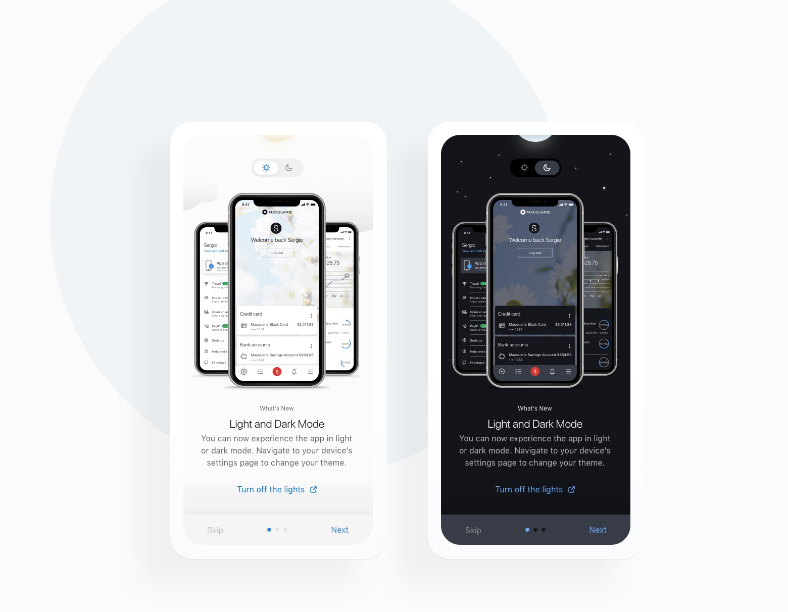
Turn off the lights

Orange is the new black, and dark is the new light. Dark mode was cool on Windows 3.1, but it truly came back with Apple’s introduction of iOS 13.0.

We wanted to keep with the times at Macquarie, of course. Just one small issue…


The challenge

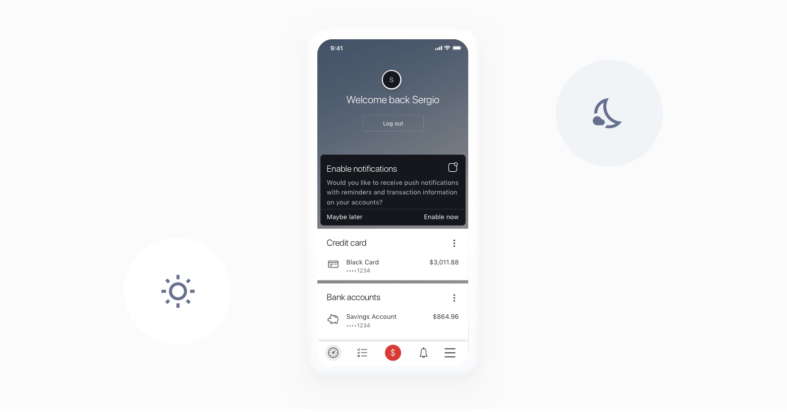
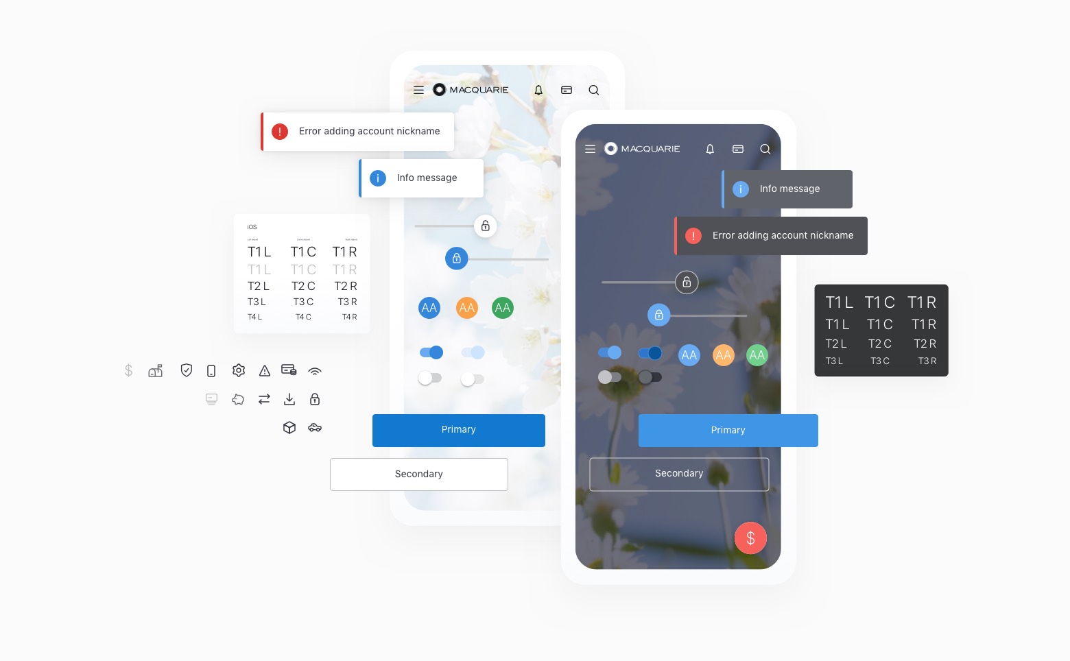
The existing Macquarie Mobile Banking app was a mix of both worlds. Some screens were white, some dark, and some 50-50. That’s one way to keep life exciting for a user! But, it also made it impossible for us to simply map colour X on light mode, into colour Y for dark mode.

Looking to reduce the ongoing overhead of juggling two separate designs for every single screen, my approach was to step back and take the app, fully,
into a proper “light mode”.

Once the light mode version was created, we could instead design and test a dark mode system, that would meet our accessibility standards.

Instead of having to design all the screens on dark mode and making our engineers inspect colours for each element, I came up with colour mapping rules that applied to the whole app – font colours, background colours, wallpaper image selection, surfaces, and elevation.

The result?

We became the first banking app in Australia to adopt light and dark mode while making sure the product was consistent on iOS and Android. As a bonus… the customers loved the clean new uplift too.